Draw the Map, Draw the World
The Sunday New York Times ran a fantastic article by Alex Mindlin, Win, Lose, Draw: The Great Subway Map Wars that details a battle that has brewed, off and on, for the past 30 years.
There are, it seems, at least two distinct systems of belief about what constitutes the proper set of assumptions for the New York City subway map. The core tension between the camps is a debate about the goals of a map this ubiquitous, one so frequently used by millions of people. Should the Metropolitan Transit Authority strive for an idealized conceptual diagram that helps people understand the system at the expense of literal accuracy? Or should the map reflect the true environment that the subway system lives in, providing necessary context even at the expense of superficial clarity?
The right answer, of course, is that we all want both. But the pendulum swings back and forth over decades, based on design trends or the arbitrary caprices that inform the workings of any large, old public institution. The good news is that all this back-and-forth leaves us with a lot of beautiful maps to ponder.
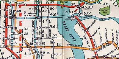
The map used in the 1930s, excerpted above, was fairly uncontroversial. As the Times story notes, the classic London Tube map was an influence on the entire genre. But the heart of the Times story is the debate over the 1972 map, which was the first NYC Subway map I ever collected, and is excerpted here, showing roughly the same area as the 1930s-era map above.
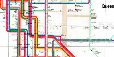
The elegance of this map is even more delightful when you know about the sheer contrariness of its creator, Massimo Vignelli. He’s quoted in the Time story defending the liberties taken in the 1972 map:
Of course I know Central Park is rectangular and not square. Of course I know the park is green, and not gray. Who cares? You want to go from Point A to Point B, period. The only thing you are interested in is the spaghetti.
For those interested in more spaghetti, as well as more plate, more cheese, and more tortured metaphors, here’s some more NYC Subway map links:
- Visual Complexity’s survey of transportation networks includes a look at the 1972 Vignelli map.
- The best independent NYC Subway site is nycsubway.org, where you’ll find a comprehensive list of maps, including some fantasy maps created by subway fans.
- Also on nycsubway.org is a comprehensive list of links to other subway fansites.
- And finally, the Abandoned Stations site, which I’ve linked to before but never get tired of exploring.