A New Design
I launched a new design for my blog about two weeks ago, but I’d been waiting until I had a chance to shake out a few of the more egregious bugs to mention the new layout and to describe some of the thinking behind it.
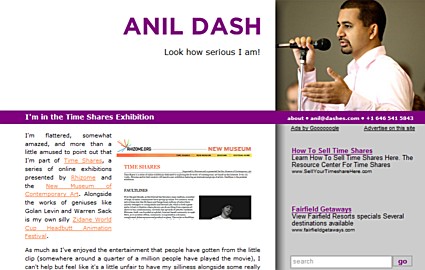
First, the page should look at least something like the screenshot you see above. The markup’s mostly valid, the CSS is mostly not hacked, but more importantly, it looks kind of like how i think my site should look.
And yep, the big picture of me at the top is a little bit pompous. I’m hoping the tongue-in-cheek nature of that comes across, but if not, it’ll just be our little joke. Coming from a family history that includes some actualpundits, I feel like I’m slightly more entitled to have some fun with the idea. Unfortunately, I think there’s about a billion political or tech bloggers using the term to describe themselves, so I’ll content myself with just naming my blog after myself. That’s worked pretty well for the past 7+ years. (Did I mention last month marked my seven year anniversary for this blog?)
One additional item I plan to add to the page is a list of upcoming events. I am doing a lot of public speaking over the next few months, and I’d love to get a chance to meet up with readers of my site. So if you have suggestions about how to present this information, or how you’d like to meet up, let me know.
There’s still some little bugs in the display, and I could probably refine the design a little bit more, but finally, here’s my new blog design. One of the things I’m most proud of is that the names of the people who comment on this site are featured prominently with the posts, both on the homepage and on the individual post pages. I really, genuinely love the high quality comments I get, so it’s likely that any final refinements to the design will be focused on highlighting good comments to have a more prominent place on the site.