Sparklines (Almost) in the Times, and Complexity Is Good For You
Last year, Edward Tufte (information design guru beloved by many web design geeks) introduced Sparklines, a method of displaying dense data as a graphic inline with words. Despite the existence of code libraries to make sparklines more ubiquitous, the technique has seen fairly little adoption, I think largely because of the focus on making the infographics inline.
Tufte defines Sparklines as “intense, simple, word-sized graphics”, but I think the “word-sized” part of that definition is probably overly restrictive. More important is the idea that graphics have a very high representational value that’s sustained even if the reader doesn’t absorb 100% of the data being presented. I don’t have to know the meaning of every data point if the overall graphic communicates the point the author is trying to make.
In short, they’re data-dense but somewhat deliberately opaque about the data sources which informed their creation. The liberating constraint placed on the graphics is that it’d be impossible to provide a key detailing each item in the space provided, so the reader is freed from the burden of having to know what each point means: All forest, no trees.
So, I was pleased to see sparklines-like graphics being used in today’s New York Times Magazine. The graphics are (appropriately) used in Steven Johnson‘s article on the increasingly complex mental demands that television is placing on its viewers.
As Steven mentions in his post on the story, presenting television as “good for you”, is just savvy marketing when talking to the Times Magazine’s audience. It’s also great promotion for Everything Bad Is Good For You, Steven’s book from which the article is excerpted.
But one of the things that struck me most about the article was its presentation (Lazyweb: Please scan the print article for me!) because the idea of story arc complexity in TV shows was repeatedly represented by graphics that evoked sparklines in their density and in their opacity about the source data.
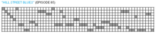
The linked graphic represents the complexity of story lines in Hill Street Blues, but the methods used to determine what constitutes an individual storyline or arc aren’t explained, and the criteria for determining parallelism in storylines aren’t articulated either. Which is great — that’s not the point of the story!
Oddly, the images aren’t inline on the web in the way they are in print (or in this blog post), probably due to some technical shortcoming in the way the Times’ publishing system works. What would be a natural point for inline graphics, or perhaps even a dynamic display that allowed for drilling into the data, is instead turned into an underwhelming pop-up window.
Now, some more details about the collection of the data presented in these graphics might be present in Steven’s book. But, in the same way that the story mentions that TV viewers are being challenged to start in the middle of a story or with partial information and connect together tenuous threads or implicit ideas instead of explicit statements, this print story is assuming that readers are willing to fast-forward past the details of information gathering and jump into the meat of the story.
There’s some implications of this kind of data presentation, of course, and I’m hoping to blog more about that later, but for now I’m just struck by how useful this kind of information presentation is, and I’m wondering why we don’t see this kind of information density more often.